Recently, our team of print experts met virtually to explain the benefits of our 7-color print program, Process +™. The video recording of this conversation is above. The transcription of the conversation is below.
Sarah:
Hi everybody. I’m Sarah Carson, Rohrer’s VP of marketing, and I’m here with a few of the experts from my team, because we’re going to talk today about Process +™. So, on this screen, you’ll see, Troy Eckstine who is Rohrer’s new Business Development Manager, and he’s working to create custom solutions for a variety of Rohrer’s customers. Kevin Booth is our manager of design and artwork services, managing our team of print designers and the pre-press group. And then Scott Nagel is here, and he’s one of Rohrer’s National Account Managers working with customers across many industries, including hardware, office, and house wares.
*All Responding*
Sarah
So, I am going to put something on the screen, but first I’m going to start with a question. I’m going to start with you, Troy. What is the difference between PMS and Process +™?
Troy:
So, what is the difference? Well, simply explained what we do is, at Rohrer Corporation. We add the addition of orange, green and violet inks along with the traditional four-color processing. And what that does is, it expands the gamut. There’s a picture that you’ll see that will actually have a triangle and the triangle represents four-color process printing and black would be in the center. And what you can see in that visual is that there’s a limited color gamut there.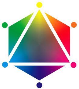
What we do is, we drop in the orange ink between the yellow and the magenta, and then we drop in the violet ink between the cyan and the magenta. And then we drop in the green ink between the yellow and the cyan. And what you’ll see is that it opens up that color gamut. What that allows us to do is actually hit the purples and the blues much closer to the true PMS color. Same with the greens and the oranges and the reds.
So, what we’ve actually been able to do by adding these three additional inks is we increase that color gamut and we get much closer. We always refer to it as good, better and best. So, the good would be traditional CYMK. So, for example: if you took 185 and you converted it, you would see what that would look like. Better is, once we drop in those three additional colors, we’ll hit much closer to the 185 and then of course the best is always the actual true PMS color.
That’s the foundation on what it is, and we’re actually able to hit about 80% of the true Pantone colors at about 80% within a two to three Delta E. As far as taking a four-color process and adding these additional three inks, we actually can improve approximately 80% of a better match of the Pantone color by adding these things.
That’s basically what it is. One thing I would add real quick just so if everyone’s always interested. Pantone does offer an extended gamut book and inside of there, you can actually see – and Rohrer does line up to this very good, but I would recommend that anybody that’s serious on this, you could go to Pantone’s website and purchase this. And it will help give you an idea of what it looks like for yourself. So that’s what it is. And we’re really excited to have this technology.
We’ve been at this better than 10 years, so Rohrer is very, very much…we’ve got this vetted out and our process very well. Kevin’s team with the color management has worked diligently to fingerprint our process, so that we can get some predictable, repeatable colors in this process. Thank you.
Sarah:
Alright. So, I’ll take this off the screen, and then I’d love to hear from Scott. You talk with so many of our customers. Can you tell us when Process +™ is the right solution for a customer? How do you figure that out?
Scott:
I’ll give you an example of a core customer that Rohrer has been supplying for 25 years-MTD. They’re an after-market parts and accessory supplier to people like Home Depot and Lowe’s and Kohler, and then their own line Cub Cadet. And each one of those customers was calling out fifth and sixth (PMS) colors. So, they internally were incurring all these extra cost for us to drop in those extra colors on the press. So, when Troy and the team started rolling out Process +™, we thought MTD was a prime candidate to sit down with and kind of review. Does this make sense for them?
And long story short, we did a little cost analysis and we tallied up their fifth color charges, and it was around $50,000 a year that they were incurring with really value added back to them. That is simply a cost that they had to absorb for the customer’s sake. So what we did, and I did work closely with Troy and his team. We did actual, color standards that reflected the PMS conversion to Process +™. We put that in front of MTD; MTD put it in front of their customers Home Depot, Lowe’s, Kohler, and then their internal Cub Cadet Division. And it was two thumbs up. I mean, it matched across the board and they really thought it was a neat program that they can roll over into a better – not the best application – but a better application than four-color process. Get the customer approval at their end and save $50,000 a year.
So, it was a program that really helped us start Process +™ because they want a lot of SKUs. So it helped us get the whole program off the ground and MTD has not looked back since. So, as we add additional lines, we convert them to Process +™. So it’s been a really good program.
It also comes into play whenever you’re dealing with a customer that has a lot of private label customers, because all these customers want to call out their own color schemes. So we are implementing that philosophy into our customers that do a lot of private label packaging and it’s a big cost savings. The pricing is parallel with our current combo program-Rohrer ezCombo℠ program. So it makes sense; it’s fairly painless. You don’t need to dig deep into the weeds to figure out- ‘is this what they really want?’ We can get simulators in front of them to show the matches. It’s a clean and easy program. And I think it’s only going to continue to grow and it has.
Sarah:
Kevin, can you talk a little bit about how the design team or the pre-press team has to work with customers to get them ready to go into a Process +™ Program?
Kevin:
Yeah. So, when we first kicked off this program, we worked with Troy and his group and we came up with a simulator. Basically, with the color- the customer can come to us with one color or with a hundred colors and say- ‘Hey, how would these look if you converted these to Process +™?’ And we have room on our simulator to put, I believe 64 patches, and we can put the same color down there. The customer gets the swatches and they can cut them out with scissors and pass them along to maybe to their end customers or into their marketing groups or wherever. We’ve devised the simulator to be… It helps the customer understand where we’re going with the color and it allows them to pass the information along. So, if I could share my screen, I have a PDF version of it that I could show you.
Sarah:
Sure; you should be able to do that now.
Kevin:
I can figure it out. [Laughter.] Here we go.
Alright. Can you see it?
Sarah:
Yes.
Kevin:
Okay. So, this is an example of PMS 294. So, you can see that we could put as many colors in here – up to 64. Typically, what we would do is put [color] 294 here with four swatches, put another color here with more swatches. That way they could cut these up and send them off to their respective teams or even their end customers. And there’s a little blurb over here about viewing it if dealing with the naked eye is difficult specifically to the lighting. So, if you have access to a light booth that it gives you the instruction there on what kind of bulbs to use. This is a simple process, and we’ve done this for several customers now, and it illustrates the point. They can take this chip, they can cut that thing out and compare it to a card or do an ink draw down, even see how close they see it with the naked eye.
Sarah:
Yeah. Cool. Thanks for helping us explain how a customer gets to test it or see it before it goes to the final print.
Kevin:
Right.
Sarah:
Alright. So Kevin, you can go ahead and hit stop screen share. And then I have a question for the whole group. One thing that I know for sure is that the benefits of moving from spot color to Process +™ helps with cost savings. Can you guys share some of the other benefits besides cost savings with moving to Process +™?
Troy:
Sure. I’ll start out. One of the advantages that I see in this is- and let me back up just a minute. When we onboarded this technology and we started to perfect it, we learned that in order to better expand the gamut and increase that true-match capability, is we changed our screening. So we traditionally want to run a 150 AM line screen. We went to a 220 concentric dot. And what that does is it actually gives a little bit more pop to the graphics, you’ll see some more details. So I like to explain it kind of like a high definition TV. You get a little bit more resolution in there. So, that’s one of the attributes from this.
I also feel that you get a much more predictable print platform, because what we’re actually doing is – we’re laying down up to three of those seven colors to create the conversion. We don’t go any further than that. That’s just kind of the best practices. And when it does, it disperses a nice even film, and it’s a better runnability for repeatability and consistency. Which is very critical in the packaging industry. Everyone wants to see that cohesive look. So that’s one of the benefits.
The other benefit is that there’s some environmental impacts. Every time that we have to buy ink, we put in an ink fountain, we have to buy so much to fill our fountains. And then when we’re done, we have to dip that ink out, and then we have to put it in a barrel and we have to have it removed and it has to be burned off. So, when we can stay in this print platform, what we can do is we can just make run, run, run, and we’re not- we’re getting rid of that environmental impact. So, those are two things that come to mind.
Sarah:
Yeah. Thanks.
And is it faster to get into a combo run with Process +™ versus a spot color?
Troy:
I wouldn’t necessarily say it’s faster. In theory, yes. I mean in theory, if we can convert everybody and we ran it that way, it would be really fast but we’re not there yet. That’s kind of the future. And I do believe we’ll be there someday, but we’re not there today. We’re building this program. The major advantage to this as Scott alluded to when he spoke to the MTD is our pricing is the same. The difference is that if they go with the Process +™ we eliminate that upcharge for PMS color. Which quite frankly, if customers look at their ROI and in their order pattern, they’re getting free cards basically by converting that over time. So, I think right now it’s really a financial benefit for the client. But long term, I do think that will help reduce our lead time overall, as we get more customers on board with it.
Scott:
“It makes us more efficient too. Like Troy said, we’re not stopping the press cleaning out two PMS colors, putting two more in. So like Troy said, it keeps us more efficient. And I think that gives us the opportunity to keep our pricing competitive parallel to, or typical Rohrer combo [pricing]. And at the end of the day, it’s good for both parties. I like it because right now, Rohrer can go out and offer this that a lot of our competitors have not even invested in. So it’s a real advantage to Rohrer- to have that to offer to their customers.”
Sarah:
Alright. Well, to Kevin, to Troy, Scott. I want to thank you all for participating in the conversation today. I think it’s really helpful to be able to share this information with the people who are thinking about switching their program or starting a brand-new program with us. I appreciate your time today.
For more information on Process +™ or to speak with a sales representative, click here.